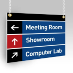
A missing sign can create a problem before anyone has time to explain it. A delivery driver enters through the wrong gate, a visitor walks past a restricted area, or a crew member misses a changing hazard. This construction site signage guide helps contractors, project managers, and site coordinators plan signs that keep work moving, protect people, and present a professional jobsite from day one.
Start With What the Sign Needs to Do
Construction signs are not all doing the same job. The fastest way to overspend or leave gaps is to treat every sign as a generic warning placard. Start by separating your needs into safety, direction, compliance, operations, and branding.
Safety signs alert workers and visitors to hazards such as overhead work, required personal protective equipment, open trenches, moving equipment, or electrical risks. Directional signs tell people where to enter, park, check in, pick up materials, use a designated walkway, or find a site office. Operational signs can identify laydown areas, dumpsters, wash stations, emergency assembly points, and authorized delivery zones.
Then there are project-identification signs. A well-made site sign can display the contractor, developer, architect, project name, permit information, and contact details. For public-facing projects, this is often the first impression neighbors, prospective clients, and subcontractors get of your company.
The message should determine the material, size, placement, and quantity. A small sign at eye level can work well for a job box or interior access point. It will not work at a vehicle entrance where drivers need to read it from a distance.
Build a Construction Site Signage Plan Before Ordering
Walk the site as if you were arriving for the first time. Consider every route: pedestrian entry, vehicle entry, delivery access, employee parking, visitor check-in, and emergency exit. This simple exercise usually reveals where signs are needed and where a sign would be ignored.
At minimum, most active jobsites need clear entry signage, restricted-area notices, required PPE messaging, emergency information, and directional signs for visitors and deliveries. Larger sites may also need traffic flow signs, subcontractor staging markers, equipment-zone warnings, floor or building identifiers, and bilingual messaging based on the crew and local requirements.
Create a sign schedule before submitting artwork. It can be a basic spreadsheet that lists each sign’s message, dimensions, quantity, material, installation location, and deadline. This gives your team one source of truth and makes it easier to reorder a damaged sign or add matching signs later.
Confirm Requirements With the Right People
Safety and regulatory needs vary by project type, site conditions, client requirements, and local jurisdiction. Your superintendent, safety manager, general contractor, or compliance lead should confirm required wording, symbols, colors, placement, and visibility before signs go to print.
Do not assume that a standard-looking sign meets every requirement. Some messages require specific language or pictograms, while others must be posted at a particular height or near a specific hazard. Printed signage supports a safer site, but it does not replace safety training, barriers, supervision, or a documented site safety plan.
Choose Materials for Real Jobsite Conditions
A construction site is hard on signs. Sun, wind, dust, rain, equipment traffic, temporary fencing, and frequent site changes all affect what will hold up. The right choice depends on how long the sign needs to last and how it will be installed.
Corrugated plastic is a practical choice for temporary signs. It is lightweight, economical, and easy to mount to fencing, stakes, or frames. It works well for directional signs, site rules, temporary warnings, and project notices that may change as work progresses.
Rigid PVC provides a clean, professional surface for signs that need more durability without adding significant weight. It is a strong option for jobsite identification, office signage, parking instructions, and other medium-term applications. Aluminum composite material is better suited to long-term outdoor signage because it has a rigid, professional feel and handles demanding weather conditions well.
Vinyl banners are useful when you need large-format messaging across a fence line, building facade, or entry area. They are effective for contractor branding, project announcements, safety reminders, and public-facing notices. Ask about reinforced hems and grommets when a banner will be exposed to wind.
For equipment labels, container markings, window decals, and smaller identification needs, durable adhesive vinyl may be the better fit. The key is surface preparation. A decal applied to a dusty, rough, or wet surface will not perform like one applied to a clean, dry, smooth surface.
Make Every Sign Easy to Read in Seconds
On a busy site, no one has time to decode a paragraph. Your sign should communicate its main message at a glance. Use plain language, a strong headline, high contrast, and simple visuals where appropriate.
For example, “ALL VISITORS CHECK IN” is clearer and faster than a long explanation about office procedures. “DELIVERIES THIS WAY” paired with a directional arrow gives drivers an immediate next step. “HARD HATS REQUIRED” needs to be large enough to read before someone enters the work zone, not after.
Avoid placing too much information on one sign. A project sign may need several company names and permit details, but a hazard sign should stay focused on the hazard and required action. If a message has multiple instructions, use separate signs in the order people encounter them.
Color can help organize meaning, but contrast matters more than decoration. Dark text on a light background or light text on a dark background generally provides strong readability. Be cautious with thin fonts, low-contrast brand colors, and photos behind text. They may look good on a screen but become difficult to read outdoors.
Size and Viewing Distance Matter
Sign size should reflect how far away the reader will be and how quickly they need to react. A pedestrian sign near a doorway can be relatively small. A gate sign for trucks, a banner along a roadway, or a warning near mobile equipment needs larger type and more open space.
Think about the reader’s conditions, too. Will they be walking, driving, wearing safety glasses, approaching at dawn, or trying to read from behind a fence? A sign that is technically visible may still fail if its message is too small, blocked by materials, or placed where it blends into visual clutter.
Keep Branding Professional Without Diluting Safety
Branded construction signage helps turn an active project into visible proof of your work. A clean logo, consistent company colors, and accurate contact information make the site look organized and established. That matters when property owners, neighbors, inspectors, and potential clients pass by.
Still, safety information gets priority. On a sign intended to warn or direct, your logo should support the message rather than compete with it. Reserve larger branding for project boards, fence banners, trailer signs, and site entrance displays. Use matching colors and typography across safety, operations, and promotional materials to create a coordinated look without sacrificing clarity.
This is also a good time to think beyond the fence line. Branded hard hats, safety vests, crew shirts, vehicle decals, banners, and jobsite signs can create a consistent presentation across the project. For organizations managing multiple crews or locations, consistent artwork files and approved sign templates save time each time a new job begins.
Plan for Installation, Updates, and Reorders
A well-printed sign still needs the right installation method. Match the mounting approach to the material and location. Fence signs may need zip ties and reinforced grommets. Rigid signs may require posts, brackets, screws, or a frame. Decals need a clean application surface, while temporary signs may need stakes that keep them visible above landscaping or parked equipment.
Inspect signs during regular site walks. Replace anything faded, damaged, covered by dirt, blocked by materials, or no longer relevant. Outdated signs create confusion and can make a well-managed site look neglected. If traffic patterns, hazards, or access points change, update the sign plan immediately instead of relying on word-of-mouth.
For repeat work, keep a record of final artwork, dimensions, and materials. That makes future orders faster and helps maintain consistency across sites. A print partner that can produce rigid signs, banners, decals, and branded apparel in one place can also reduce back-and-forth when deadlines are tight.
The best construction signage does not call attention to itself for the wrong reasons. It gives every person on site the information they need at the moment they need it, then lets the work continue safely, clearly, and on schedule.