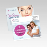
A flyer has a few seconds to earn attention. It may be picked up at a checkout counter, handed out after a game, posted on a community board, or included in an order bag. That is why custom flyers for marketing work best when they make one clear offer and give people one easy next step.
For small businesses, schools, teams, and event organizers, flyers remain one of the most practical ways to reach people in a specific place. They are affordable, easy to distribute, and tangible enough to stay on a desk, refrigerator, or bulletin board after the first interaction. The difference between a flyer that gets noticed and one that gets ignored usually comes down to planning, not flashy design.
Start With One Job for the Flyer
A common mistake is trying to fit an entire business, event, or organization onto one sheet. A flyer is not a brochure. Its job is to move the reader toward a single action: visit a location, scan a code, register for an event, call for a quote, place an order, or bring in a coupon.
Before choosing colors or photos, write the action you want the recipient to take. A restaurant might promote a weekday lunch special. A school PTO may need families to attend a fundraiser. A contractor may want homeowners to request an estimate before a seasonal rush. Each of those needs a different headline, offer, and distribution plan.
If the flyer has two equally important messages, consider producing two versions. Separating a grand opening promotion from a hiring announcement, for example, makes each message easier to understand and easier to measure.
Build Custom Flyers for Marketing Around the Reader
The most effective flyers answer the reader’s first questions quickly: What is this? Why should I care? What do I do next? Those answers should be visible without reading every line of copy.
Lead with a headline that names the benefit or event. “Free youth basketball clinic this Saturday” is stronger than “Community sports announcement.” “$20 off your first service visit” is more useful than “Welcome to our company.” Specific language respects the reader’s time and gives them a reason to keep looking.
Your supporting copy should handle the details: date, time, location, offer terms, contact information, and any deadline. Keep the text short enough to scan from a few feet away. If a detail is not necessary for the next step, it probably belongs on your website, registration page, or follow-up email rather than the flyer itself.
Give the Call to Action a Clear Home
Every flyer needs a call to action that stands apart from the body copy. Use direct wording such as “Scan to Register,” “Bring This Flyer In,” “Call for a Free Estimate,” or “Order by Friday.” Place it near the bottom or in a colored section where it will not blend into the rest of the design.
A QR code can be useful when it goes to a mobile-friendly page with the exact information promised on the flyer. Do not send people to a general homepage and make them search. Include a short web address or phone number as a backup, since not everyone wants to scan a code.
Choose a Size and Paper That Match the Job
Format affects both the look of your flyer and how people use it. A half-page flyer is convenient for handouts, counter displays, bag inserts, and door-to-door campaigns. A full-page flyer gives more room for event schedules, menus, service lists, or larger images. Smaller postcard-style pieces can feel more personal and are easy to carry.
Paper choice should support the setting. A standard matte stock is a smart, cost-conscious option for high-volume promotions, school notices, and short-term campaigns. Glossy paper can make product photos and bright graphics stand out, while heavier cardstock gives invitations, premium offers, and appointment reminders a more substantial feel.
There is a trade-off. Thick cardstock feels polished but can increase cost and may not be necessary for a quick handout. A lighter stock may be the right choice when you need thousands of pieces for a parade, campus event, or neighborhood distribution. Decide where the flyer will be used before paying for upgrades that do not add value.
Design for Fast Recognition, Not Just Good Looks
A flyer should look like it belongs to your organization. Use your logo, brand colors, and type styles consistently with your custom shirts, banners, signs, and other marketing materials. When a customer sees the same visual identity on a staff polo, storefront sign, and printed flyer, the message feels more established.
Use one strong image rather than several small, competing images. For a service business, that may be a clean photo of completed work. For a school event, it may be a photo that shows students participating. For a sale, the offer itself may deserve the largest visual space.
Avoid placing important text too close to the edge, and leave open space around your headline and call to action. Crowded flyers can look busy even when the information is technically present. A simple visual hierarchy is more valuable than adding another badge, logo, or paragraph.
Before printing, review the final proof at actual size. Check that phone numbers, dates, pricing, and addresses are correct. Make sure light-colored text has enough contrast against its background. If you use photos or logos, submit high-resolution files so they print cleanly instead of appearing blurry or pixelated.
Match Distribution to the Campaign
Printing is only half the plan. Distribution determines whether the right people see the flyer at the right moment. A gym promotion belongs near local fitness businesses, apartment communities where permitted, and partner events. A youth program flyer may perform best through schools, rec centers, parent groups, and team activities.
Think about timing, too. A flyer for a one-day event should arrive early enough for people to plan, but not so early that they forget. Seasonal service offers often benefit from several smaller distribution waves instead of one large drop. A restaurant can rotate new offers monthly, while a business-to-business campaign may need a longer timeline and a follow-up call or email.
For local organizations in North County San Diego and throughout Southern California, flyers can be especially effective when paired with in-person community activity. Include them with customer orders, place them at approved local partner locations, hand them out at events, and give staff a stack to share during regular service visits.
Track What Actually Produces Results
You do not need a complex campaign to learn whether flyers are working. Use a unique promo code, a dedicated QR code, a specific landing page, or a simple phrase customers can mention when they call. These tools show which offer and distribution point generated action.
Track a few useful numbers: how many flyers were printed, where they were distributed, how many inquiries or redemptions came in, and what each response was worth. If one version gets more scans but another produces more paid orders, the second flyer may be doing the better job.
Keep notes after each campaign. You may find that a bold offer works best for first-time customers, while an event flyer needs clearer parking details and a larger date. Those small adjustments make the next print run more effective and reduce wasted inventory.
Order With Enough Time for a Proper Proof
Deadline pressure can turn a simple flyer into a costly rush job. Build in time to review artwork, confirm quantities, and think through distribution before the boxes arrive. If your project includes matching shirts, banners, stickers, or signs, coordinate the artwork early so every piece uses the same colors, message, and logo treatment.
Alchemy Print Co. can help organizations turn an approved concept into professional flyers that fit the rest of their branded materials. Whether you are ordering a straightforward event handout or building a coordinated campaign, clear artwork, realistic timing, and a focused message will give your print run a better chance of producing real responses.
The best next step is simple: choose one offer, one audience, and one action, then build the flyer around that decision. When the message is easy to understand, people are far more likely to keep it, share it, and act on it.